
The CIA
This is what really, really serious sounds like.

Hello hello,
No time for small-talk this week. Or emojis. This is serious. In fact, this might be the most serious tone of voice ever implemented. Yes, I used the word implemented deliberately. Observe: the CIA.

Your briefing:
The CIA is America’s foreign intelligence service. It gathers and analyzes national security information from around the world. It does this primarily through ‘HUMINT’ (human intelligence-gathering) plus what my sources (OK, Wikipedia) call ‘covert operations’. Presumably a euphemism for a plausibly-deniable mix of old skool spying, Bourne Identity-ish shenanigans, and Black Site ‘enhanced interrogation’ stuff. Ahh, the Western military-industrial complex.
Until last year, the CIA had a regular-style US Government website, with a crappy Windows 98 aesthetic and requisite bureaucratic tone to match. But no longer.

Mission: Impossible?
In 2021 the CIA refreshed its design. The site is now sternly minimalist and monochrome. Initially, Design Internet scoffed. Journalist Max Pearl said the new logo was basically a poster for MUTEK. The LA Times called the new look ‘black site aesthetics’. But then everyone got over the weirdness that’s always felt when an organisation like this dips its toe in branding for the first time and admitted it was a huge improvement.
Predictably, commentators focused on the visuals and nobody really noticed the tone. Which is a shame. Because the tone is sharp. Firing up the homepage now:

‘We are the Nation’s first line of defense’. Bold, confident, serious. Like the people in the photographs all over the site, it has a kind of thousand-yard-stare coldness to it.
But it’s the sub-line I really like: ‘We accomplish what others cannot accomplish and go where others cannot go’.
That repetition. The way the second half of the sentence mirrors the first. It gives it the cadence of high oratory. And that ‘cannot’ is perfect. Copywriting orthodoxy these days is ‘use contractions like ‘we’re’ and ‘can’t’, they’ll make your copy sound friendlier’. But the CIA aren’t – oops, are not – here to be friendly. It’s ‘we are’ and ‘cannot’ all the way. In a home page that’s carrying no less than three portentous statements – ‘we are the Nation’s first line of defense’; ‘carry out the work of a Nation’ and ‘FIND YOUR CALLING’ – it’s that ‘cannot’ that really makes it a tone.
Shall we check out the ‘About Us’ page? Of course. Stand by:
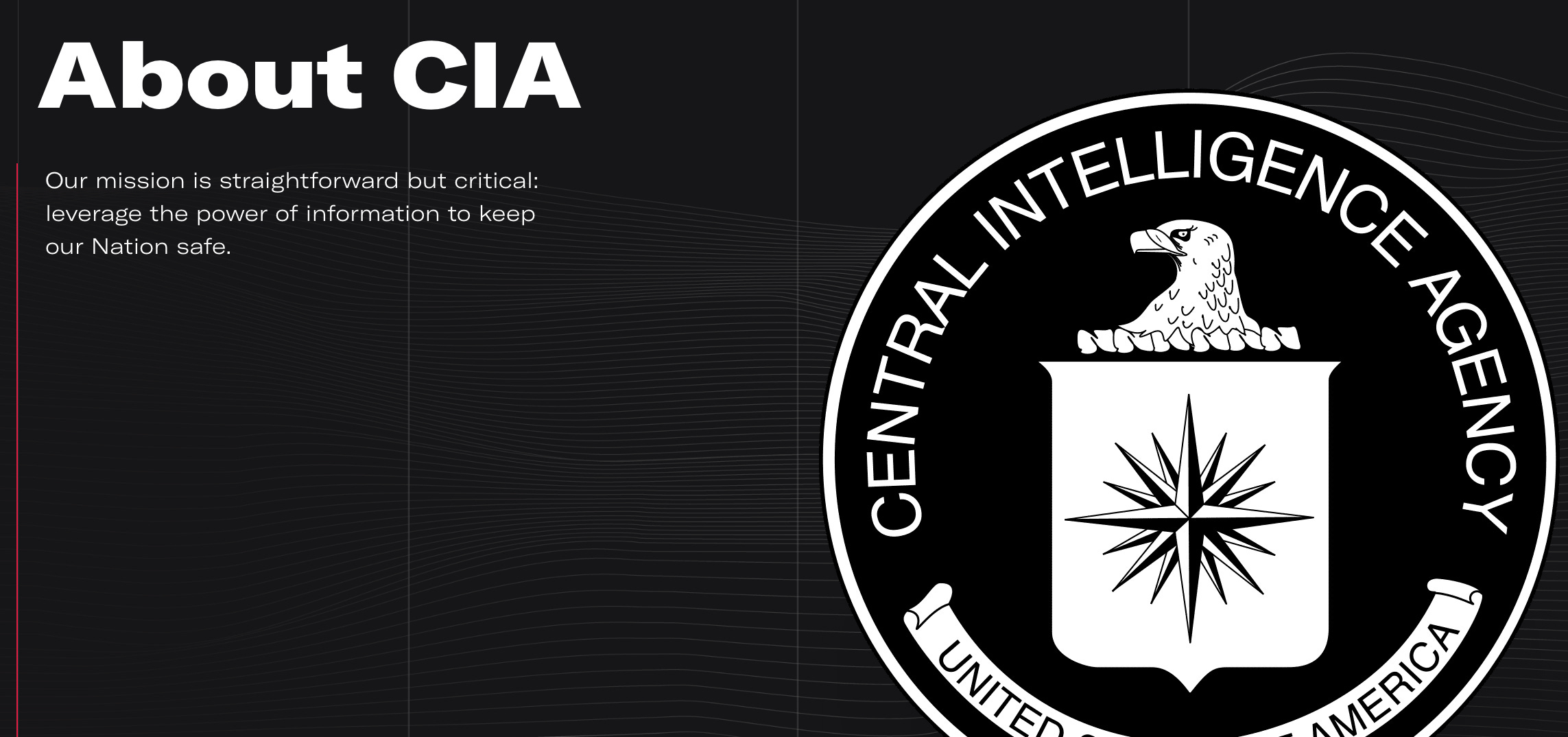
It’s the shortest, starkest, bluntest ‘about us’ page I’ve ever seen. It’s said everything it needs to say. You can practically feel it holding the blank space, staring at you, waiting for you to break first.
Let’s carry on. The ‘legacy’ page next. I need to show you the whole thing:
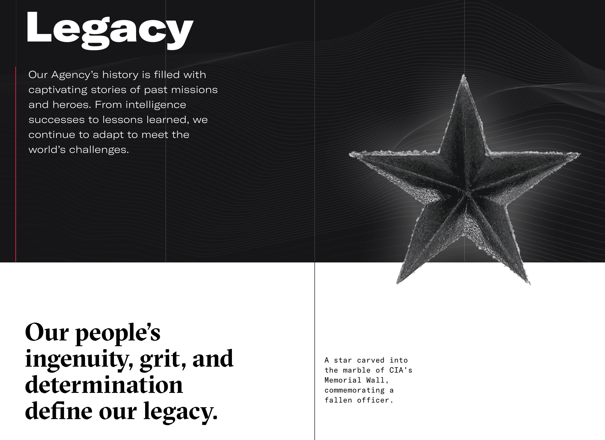
Each short paragraph is a little staccato burst. Even the words in that image caption are hard: ‘carved marble’; ‘Fallen officer’. The overall effect is so stark that the single word ‘captivating’ in that top paragraph, with its glimmer of regular human emotion, feels weirdly out of place.
On we go. A few more clicks and I’ve learned that CIA is made up of five ‘Directorates’. What exactly do they do? Good question. Here’s the description of the ‘Directorate of Analysis’:

Again with the staccato rhythm. Casual name-drop of the President. And there’s something fascinating about how that description of the people – ‘excellent puzzle-solvers who take information, often with missing pieces, and make sense of it’ – is dropped in the middle. It’s a dash of personalisation, then we’re straight back to talking about process. It’s a flourish that adds to the overall sense of high-status excellence.
Here’s fascinating: I said earlier that the CIA’s old site had a clunky bureaucratic tone. But in fact a fair bit of it was more relaxed than this. Check out this old bit of blurb talking about the symbolism of the CIA’s seal:

It mentions normal real-life things like T-shirts and movies! There are some friendly open questions! It’s positively chatty! Compare to how the new site does it:
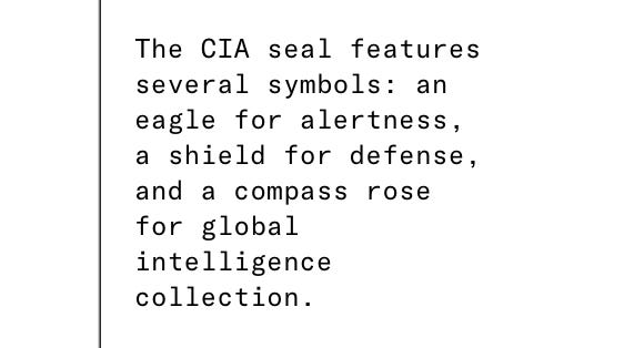
No friendly preamble. No attempt to connect to regular life. Just the facts. Delivered as succinctly as possible.
Filing Intelligence report:
At this point, I’m noticing a couple of things. The first is that the stark rhythm has done its work. All those short sentences have got inside my head. It’s influencing how I’m writing these sentences now. Almost every sentence is coming out the same length. And this goes on for slightly longer than is comfortable. The effect is slightly disconcerting I have to say. It makes the writing feel cold – but also authoritative, high status and extremely in control.
(I suspect this sort of dramatic efficiency is what corporatespeak thinks it sounds like, but flubs by prattling on, trying too hard to sound clever – and, well, just not having important enough content. Is your job ‘protecting a nation’? Is your boss the President of the United States? Well then.)
The second, related thing, is the slightly disconcerting effect of all the high seriousness and absence of emotion. We’re so used to wit and humour in almost everything these days that its absence is palpable. This isn’t something you notice straight away, but something that builds quitely in the background.
The CIA’s website exists largely as a recruitment tool. And the tone nails that perfectly. By removing the overt emotion and setting up that clipped rhythm it is unexpectedly stirring. By not admitting of any emotion at all, it paradoxically creates an emotional effect.
Three observations to gather, integrate, execute:
What if you’re not ‘conversational’?
The vast majority of the time, making your writing sound like everyday speech is the right choice. In fact, it’s so often the thing to do that we forget there are other options. What would happen if you made your writing deliberately less like regular speech?
What design elements amplify your voice?
Notice how the CIA site uses its design elements really well. It’s a tone that SPEAKS IN HEADLINES. But it’s often the subsequent bold sub-line that clinches it – carrying on that headline-speak for a couple more sentences. And the way they’ve elevated the picture captions to an essential element of the voice. Each picture caption is a little briefing.
What are your stealth tactics?
For me, the secret of this tone is in that terse, staccato rhythm. And it’s an effect that works on you over several pages. We often end up thinking about brand writing in paragraph-sized chunks – a PowerPoint slide’s worth of copy; a few lines of ‘before and after’ in a guideline. Remember to pay attention to the way your tone works over time, diffusely.
That’s all. What did you think? Email me and let me know. Covertly, of course. This newsletter will self-destruct in five seconds.